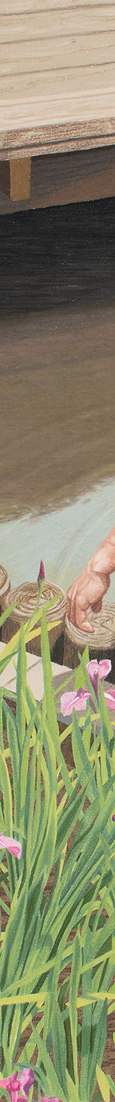
Detail of
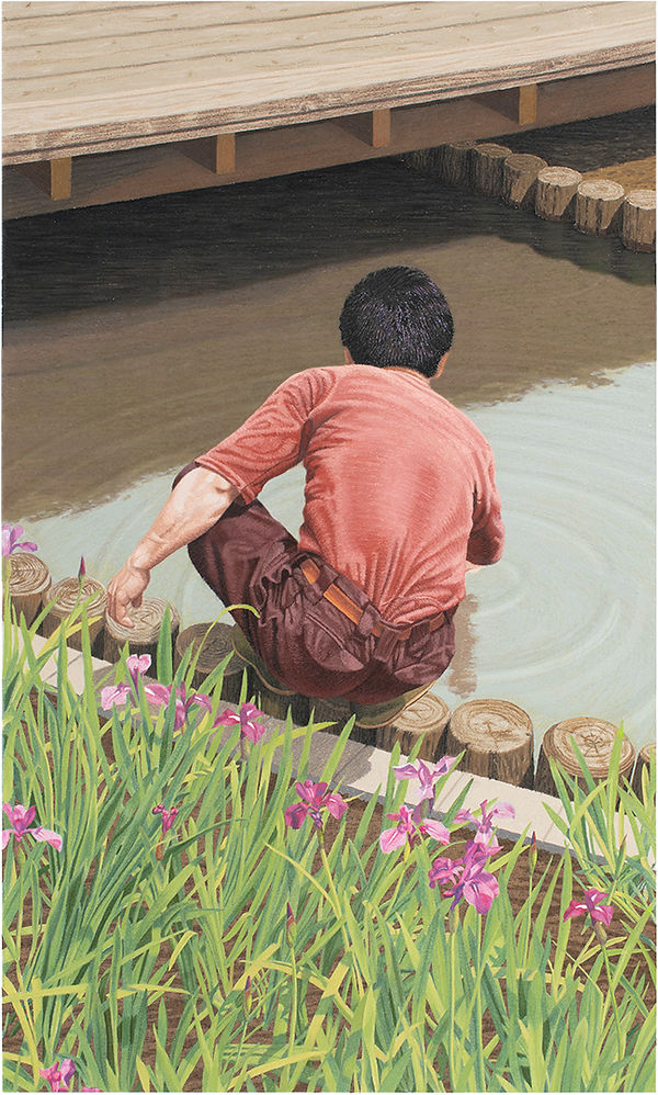
Bridge Over Irises
BRIDGE OVER IRISES: artist's notes
SKU: 5
A Japanese aesthetic sense is second nature to me, having grown up in traditional Japanese houses and having lived around traditional Japanese woodblock prints, paintings, pottery, flower arrangements, and Japan's wonderfully refined sense of craftsmanship. It is an aesthetic that I love, and is infused in me and my art. Of course there are other influences from other sources as well. But I want to focus on two aspects of Japanese art, evident in Bridge Over Irises, that particularly impact me.
One is the strong sense of negative space in traditional Japanese art–for example, the white space in black-ink brush-drawings, where the empty, negative space (of the white paper) is as important as the black brush strokes. Or the negative spaces (or air) between the flowers, leaves and stems of a traditional Japanese flower arrangement, which are not blank but are as important as the flowers themselves. Even the music of the shakuhachi (the hauntingly, beautiful bamboo flute) creates silence between the sounds. It is akin to the silence you can actually hear when walking through a woods after a snowfall. Western music can be interspersed with silence, but rarely creates it. Traditional Japanese artists create this empty space with focused skill and intentionality. It is not just a blank area with nothing in it in a drawing or in a flower arrangement or in a piece of music. It is something that they consciously create and can be tangibly seen or heard or felt.
In Bridge Over Irises there is no actual white space, but the negative spaces between the man and the bridge, man and the canal banks, man and the reflection of the bridge are at the core of the composition. In my giclée prints I am very conscious of the space between things–of how shapes or objects interact with each other, and whether they resonate with each other across distance. Should the size or shape be adjusted? Should the angle be sightly changed? Should it be moved over one way or the other? You can feel when it is off–when the space between objects is not energized.
The second influence is the way Japanese woodblock prints crop objects along the edges of the picture. The edges of my prints are intentionally active, where many small shapes are formed by cropping. This creates dynamism in the composition. It also draws attention to the edges, which are the flattest part of a picture–a flat, white border from which hangs the compositional "structure." My compositions don't just float in the middle of the artwork. They are anchored to the flat edges, "stretching" across the entire picture–with depth penetrating this "structure."
Interestingly, when Japanese woodblock prints arrived in Europe in the late 1800's, European Impressionist artists were influenced by the "flat" or shallow compositions created by cropping (and other techniques). Impressionists also started creating flatter, shallower paintings– eventually leading to abstract art.
As discussed above, my prints are not just "flat," but always combine the "flat" arrangement of shapes with deep space. But Bridge Over Irises has less depth than usual. Shallower depth, along with the downward angle of the camera, tips the picture forward, bringing the bridge at the top quite close to the viewer. So the picture looks fairly vertical–somewhat reminiscent of a Japanese hanging-scroll-painting. And the man is framed by a zigzag pattern of shapes, cut off at the edges–like the figure of a person in a traditional home interior in a Japanese woodblock print, viewed from a high vantage point. So this makes Bridge Over Irises the closest of all my prints to the Japanese aesthetic.
I instinctively sensed a good deal of this through the camera lens when I took the original photo, but only verbalized it later–partly to myself when I was working to solve the composition, and more fully to you now that the giclée print is finished.
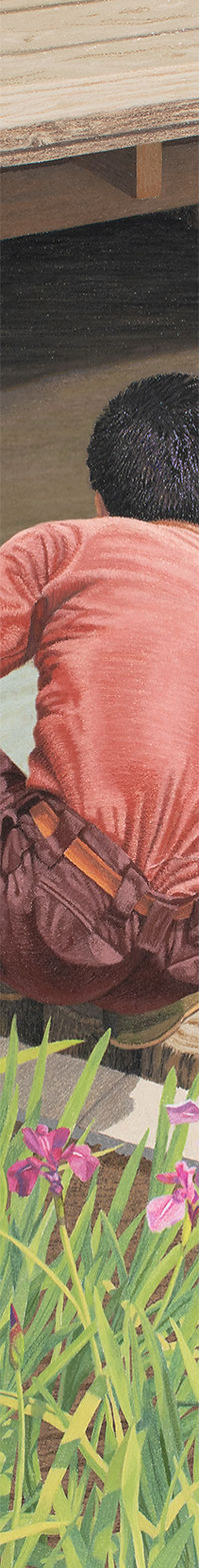
Detail of
Bridge Over Irises